


Pre-released Batman looked entirely different from what he is now!
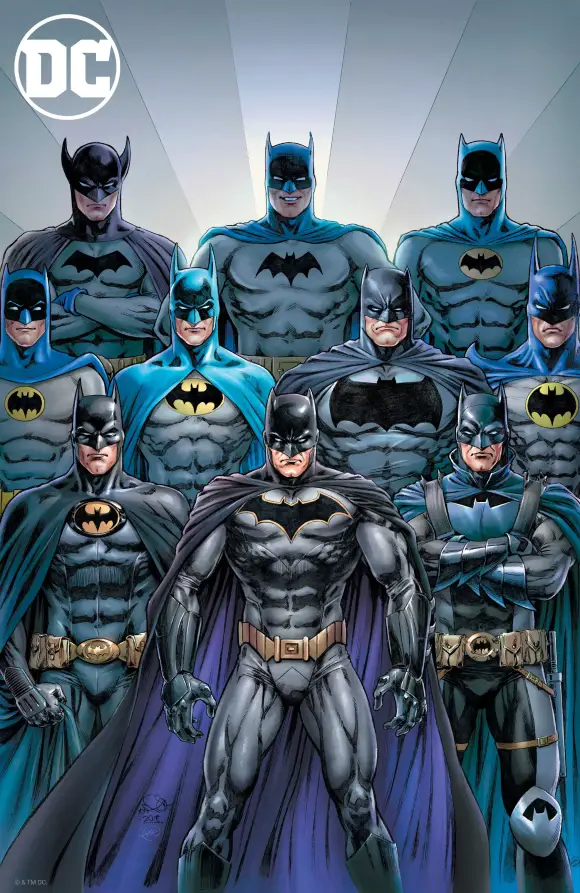
As we know, Batman is one of the most recognized characters, alongside Superman, Spider-Man, Wonder Woman, Wolverine, The Simpsons, and many others in pop culture, no matter what time period it is. And the costume was well-received by everyone. But the costume has a story…a story… of suggestions and redesigns that made it the costume we all love.
Batman’s original design had a different look!

The Dark Knight made his debut in Detective Comics #27, created by Bob Kane & Bill Finger. The first issue introduced the Caped Crusader in his cape and cowl costume with the Bat symbol on his chest. In passing time, other than minor alterations, the major elements of Batman’s costume have remained consistent throughout. But a recently resurfaced sketch by Bob Kane for the Gotham Protector is entirely different.
No copies of the original sketch were ever found. But based on Bill’s description of the original sketch, comics historian and artist Arlen Schumer for Alter Ego magazine in 1999, recreated the image on top. This recreation shows that it looks nothing closer to the Batman we know or grew up reading. As many say, it looks more like a Flash Gordon with wings! The only similarity it had was that there was a yellow utility belt, a black-wing-like cape, but other than that, it looked like Robin swinging by. Oh, and Bruce Wayne was a blond! This seemed more like a blond guy (Bruce was always a black-haired guy) swinging around on a grappling hook in a rejected Robin costume!
According to The Steranko History of Comics by Jim Steranko, Bill Finger once said that cartoonist Bob Kane “…had an idea for a character called ‘Batman’, and he’d like me to see the drawings. I went over to Kane’s, and he had drawn a character who looked very much like Superman with kind of … reddish tights, I believe, with boots … no gloves, no gauntlets … with a small domino mask, swinging on a rope. He had two stiff wings that were sticking out, looking like bat wings. And under it was a big sign reading, BATMAN”
The one by Bob resembled pulp heroes like The Shadow or Zorro, and the Robin prototype suit didn’t help convey the dark, mysterious tone that was wanted. The then-National Comics (DC Comics) Editors, like Vin Sullivan and Whitney Ellsworth, suggested changes to distinguish Batman from Superman and thus pushed for a dark costume, a cowl with bat ears, a cape instead of stiff wings, and the removal of firearms and lethal behavior that were present in early sketches. Bill Finger made some key changes by redesigning the costume and suggesting a scientific detective-themed character to become a dark icon of the DCU instead of a pulp-themed vigilante or the then-bright-themed Superman, who was also making news in the comic world. Even Grant Morrison, in his Supergods, gives credit to Bill Finger in shaping the Batman we know.
Batman’s original costume was black and grey. But as comic was limited to six colors at that time, blue was used as a highlighting color. And in time, the blue color stayed in designs, but it still meant black and grey as it was originally meant.
Legendary comic writer, Arnold Drake, pointed out at a Comic-Con, “Bob [Kane] had gotten to the point where he never drew anything. Never drew anything on the Batman comics, anyway. [Sheldon] Moldoff was ghosting them all, and when he didn’t, someone else did.”
Pic Credits: “Batman” by Arlen Schumer, Courtesy Alter Ego magazine (1999)